
Principles of adaptive design
“The problem with intelligence at the user interface is that it may violate many of the good usability principles developed for direct-manipulation systems.” Höök 2000, p. 3
Make it unobtrusive
An Adaptive UI has to support the efficiency of the user. Many studies pointed out that to support the efficiency of the user, e.g. speed in processing a task, reducing workload, interfaces that offer an adaptive part as addition to the non-adaptive part of the UI and clearly divided them up outperformed their complete non-adaptive counterpart (Gajos et al. 2006, Findlater & Gajos 2006, Findlater & McGrenere 2004).
This is due to several reasons, e.g. the user’s ability to easily ignore the adaptive part if not needed or the ability of the user to develop a spatial model of the interface (Findlater & Gajos 2009). Adaptivity is no excuse, for an interface that doesn’t work well before (Höök 2000). Findlater & Gajos (2009) lay out that: “one of the more important design decisions is whether the use of adaptation should be elective or mandatory, that is, whether the user is able to ignore the adaptation or not.”
The intelligent support should not distract the user from normal usage of the application (Hartmann 2009). A counterexample for this used by Hartmann (2009) is Microsoft’s Office Assistant, widely know as Clippy. The virtual assistant was constantly moving in the right bottom corner of the application and thus drawing the user’s attention to it without providing any relevant help for the user’s current task (see Figure 44). Clippy was suffering from „optimization for first time use“ problem (Pratley 2004). Therefore, when the adaptive part of the UI is divided from the non-adaptive part and implemented as supportive addition, the adaptation has to be made unobtrusive (Jameson 2008, Langley & Fehling 1996).
Prevent Interruptions
Adaptive UIs have to evaluate their user model in order to make better recommendations or try to recommend a smarter alternative for a certain user task. This may result in an interruption of the user while interacting with the system. Interruptions are a powerful tool and have to be used wisely in any situation of HCI. You have to remember that interruptions that happen at the wrong time have negative side effects on user satisfaction, e.g. distract a user. While interruptions that are well timed have a chance to support or delight a user. When the interruption happens when it is not supposed to, e.g., interrupting the user while executing a sequence of actions, it may cause users to forget which action was planned next or even make the user to start the sequence of actions over again. However, when interruptions happen at the right time, e.g. the user is trying to fulfill a crucial task (e.g., delete multiple emails), they can prevent the user from making a mistake or correct actions. Interruptions can also contain some sort of gratification or questions, e.g., achievements the user gained, feedback questions or recommendations.
Adaptive UIs should be equipped with some measures for autonomous decision making, on when to interrupt the user. I propose these measures to contain three components: interaction, flow and context. To decide on the best time for interruption, the times of user interaction with less interaction, e.g., at the end of a sequence of actions, are better than the times a user heavily interacts with a system, e.g. typing a message or scrolling. While the user is heavily interacting with the system, unobtrusive interruptions are better than obtrusive fully screen interruptions. There are times in a user flow when interruptions have less negative side effects, e.g., at the completion or short before completing a task (email sent), and there are times in a user flow an interruption can cause major negative side effects, e.g., while fulfilling a task the user is interrupted constantly. Interruptions that don’t fit the context, e.g. not task related questions or recommendations, have a higher chance to upset the user. If instead an interruption fits the context and is supportive or helpful, the chance to improve the overall user satisfaction is higher.
This illustrates how important it is to think about the right timing for user interruption. Additional to the timing, the frequency is important, because high frequency interruptions can bother a user. Think of a system that asks you for approval (“Do you really want to delete this item?”) every time you try to delete an item.
Adaptive UIs also have the ability to provide context instead of only preventing users from a mistake. Take for example the action of deleting an important document. A non-adaptive system would ask: “Do you really want to delete this document?”. This causes the user to stop for a second, but in order the question is, if this action was the user’s intention, the user approves and the important file is gone. This is because the action wasn’t the mistake, the mistake was the wrong file (Norman 2002). So rather than asking for an approval of the action, Adaptive UIs can provide context about the file inside the interruption, e.g., “You’ve worked two times on this file today. Is this the right file you want to delete?”.
Adaptive systems have the ability to trigger interruptions based on the interaction, flow and context. Adaptive systems can also evaluate the efficiency and the right timing for an interruption with the help of some measures, e.g., the time of response or the ignorance of an unobtrusive interruption.
Work well before
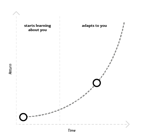
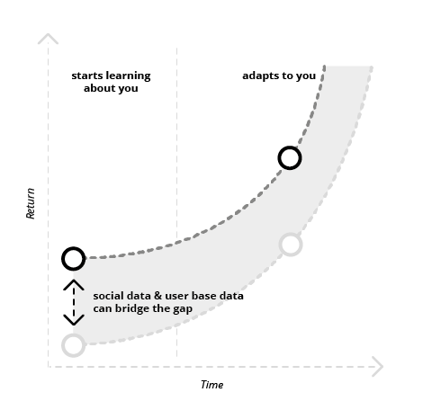
Many Adaptive UIs can’t rely on a huge amount of data at the beginning, especially if they need data for each individual user (Hartmann 2009). Because of the systems learning curve, Adaptive UIs need to work well from the beginning. They have the need to have an initial good experience (Billsus et al. 2002). Adaptivity is no excuse for shitty design, „the whole system design should meet users’ needs[…].“ (Höök 2000, p.8) The learning algorithms of Adaptive UIs “may need to be „trained up“ before the benefit of their learning becomes apparent.” (Lieberman 2009, p.18) Krishna (2012) describes that interfaces that adapt to an individual user may provide not so much in return at the beginning. But over time these system can provide a much higher return (see Figure 45).
Make it delightful
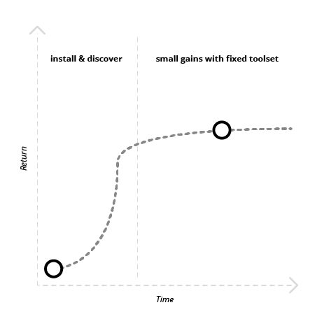
Krishna (2012) mentioned that most software immediately starts losing whatever value it adds to the user’s life the moment the user starts using it.
The software features that were built for the average person may surprise the user at the beginning, but over time loses their delight due to their generic facelessness (see Figure 46). Höök puts it that way: “The real test for intelligent user interfaces is whether they continue to be used after the initial excitement is gone“ (Höök 2000, p. 13).
Challenge the user
While this is mostly a problem for static direct-manipulation software, Adaptive UIs can do better. Their ability to adapt to the skill level of an individual user makes those systems likely to achieve something which is called flow in psychology. While researching happiness and productivity in the 70th, Csikszentmihalyi stumbled upon the phenomenon of flow, which he described in 1975 as “the holistic sensation that people feel when they act with total involvement.” (Csikszentmihalyi 1975, p.36) He later adds that flow is all the positive aspects of human experience. This includes joy, creativity and the process of total involvement with life (Csikszentmihalyi 1990).
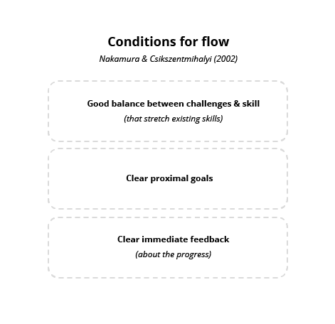
Csikszentmihalyi figured out that to enter a state of flow, you have to do something that matches your level of skill, but challenges you slightly. By pushing you to a new level, each time the challenge aligns with your level of skill, you can enter a state of flow, or optimal experience. In a state of flow, people reported to experience joy, creativity, loss of time, and were observed as most productive.
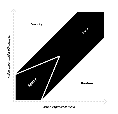
Note: Flow requires to challenge, so it’s crucial to remember that it shouldn’t be challenging to use software. What we’re using the software for should be challenging, not the software itself.
Therefore, the flow state can help to get users constantly excited and delighted by an application. There are two more prerequisites that have to be met to achieve flow. (1) The user must be given a proximal goal that provides clear guidance and structure to the process. (2) The application must provide clear immediate feedback about the progress (Nakamura & Csikszentmihalyi 2002).
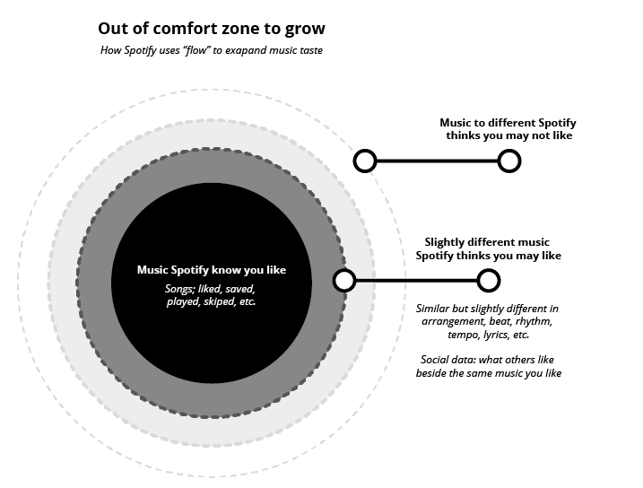
One example of an application that fulfills all those prerequisites to get users in flow is Spotify. The music streaming application supports the user in expanding his or her music taste by recommending music that is slightly out of the users comfort zone. Spotify does this by analysing nearly 400 musical attributes, covering the qualities of melody, harmony, rhythm, form, composition and lyrics. This makes the songs comparable, and enables Spotify to build a deep understanding of its users music taste. Spotify challenges the user by recommending music that is slightly out of the area of music the user normally listens to. Not too far from this area, but different enough that Spotify can predict the user will like it. This means the goal is clearly set, that the user wants to experience new music. Clear immediate feedback is provided by the music playing and the constant evaluation of the user model. When you skip a track or push the thumbs down button, Spotify recognizes that its prediction was wrong and instantly adapts the query of the songs to follow. Therefore, Spotify can provide a good balance between challenge and skill, bringing the user back on track into the flow when he got distracted by a song that was not his taste.
Spotify uses social data and data of the total user base to recommend music to get you up and running, when it knows nothing about your music taste, e.g., at first time of use (see Figure 50).
It’s the psychology principle of flow that unleashes the applications’ enormous value over time. It feels to the users that Spotify knows their music taste better than they do themselves. The fear of losing the value when switching to another application is what gets the users stick to Spotify. Since another application has to learn about the user‘s music taste from the very beginning, it can’t immediately provide the same value as Spotify.
Make it usable
“Unfortunately, we know that if an adaptive system gives the wrong advice just once, users’ trust in the system will go down drastically, and they may not use the system for a long time.” Höök 2000, p.6
There’s a principle called “Garbage in, garbage out” (GIGO) in computer science. It means when the user is capable to put in invalid data (garbage), the system will, regardless of its accurate working logic, also produce garbage (Techopedia 2016). We can apply several strategies described on the following pages to prevent the system from collecting invalid data and manage the system to keep stable when things go wrong, which they will do sometimes.
Validate
To prevent input of invalid data, Adaptive UIs have to validate their predictions and understandings. They can, for example, ensure the quality of labels by explicitly asking for approval (see Figure 51). Such explicit labelling prompts should not be used frequently, as they are likely to annoy users.

A more unobtrusive example of validation can be found in Spotify. Spotify validates their user model two ways, (1) by explicit asking, and (2) by implicitly collecting data. The application asks the user explicitly to validate the recommendation by using simple “thumbs up”, “thumbs down” buttons to judge the song recommendations while the user listens to a radio station. Spotify collects implicit data by the user skipping, repeating or saving songs to validate the song recommendation query.

Give time to correct
Adaptive systems make recommendations that skip multi screen transactions, for tasks otherwise consist of many steps and may fill more than one screen. The fulfillment of the action by the system, instantly after the decision of the user to go with the recommendation, causing to skip several steps, can result in a bad experience. Because the user may not be able to inspect all the steps the system will take before.
For example, Google Maps says your commute to work will need 25 Min and asks to start navigation. The user decides to go with the recommendation but at time of the decision he wasn’t capable of understanding all the information needed to make a proper decision. The system may have picked the fastest route, which leads the user around traffic, but this results in a much longer distance. Instead of leading the user directly to navigation, the system can implement a little break, between the decision of the user and the start of the navigation. This gives the user the time to understand the full impact of the recommendation on his route and easily abort or correct the recommendation. This means the break has to provide a more detailed information about the action to happen than the initial recommendation itself. Furthermore, this strategy is more useful when the cancellation or correction of the started navigation require more steps than the cancellation before the navigation started.

Fall back
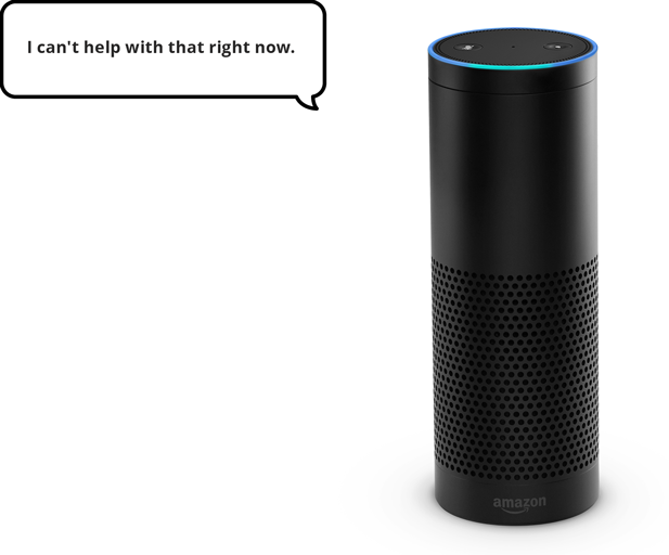
One strategy to keep the system usable is to implement the adaptivity in predefined areas, so that the greater part of the user interface remains stable (Hartmann 2009). If things go wrong, an adaptive UI should be capable of using non adaptive mechanisms to stay usable. Examples for this are the personal assistants Apple Siri and Amazon Echo. Siri is an addition to the iOS operating system that offers you help when needed and otherwise disappears in the background. Amazon Echo is the adaptive system itself, therefore the system can’t fall back on non-adaptive mechanisms like direct manipulation. Amazon Echo’s only fallback is the manual volume control ring at the top of the device to regulate Alexa’s volume of sound output. Apple Siri falls back to direct manipulation of the operating system if she can’t find what the user is looking for, e.g., propose to perform a web search or navigate the user right to the app store.
Make it trustworthy
As mentioned in chapter 3 Privacy & Trust, besides the user‘s ability to predict and understand the system‘s behavior and feel in control, the domain of Adaptive UIs has to deal with a topic which got also quite popular for conventional user interface design, trust and privacy concerns. This chapter presents several strategies based on the factors provided by Höök to make an adaptive system more trustworthy.
Höök (2000) names three factors that deeply influence the user’s trust in a system. She names that in order to trust a system (a) the user has to feel in control of the system, (b) the user must be able to understand the system’s behavior and (c) the user’s privacy must be sufficiently protected.
Explain systems action
Adaptive systems have to explain the use of data for adaptation to the user. Because there is nothing more painful to a user than to feel observed and inspected without knowing what exactly is going on. Intelligent systems have to tell the user which data they use and what they will do with it, so the user feels in control and is able to understand the system’s behavior.
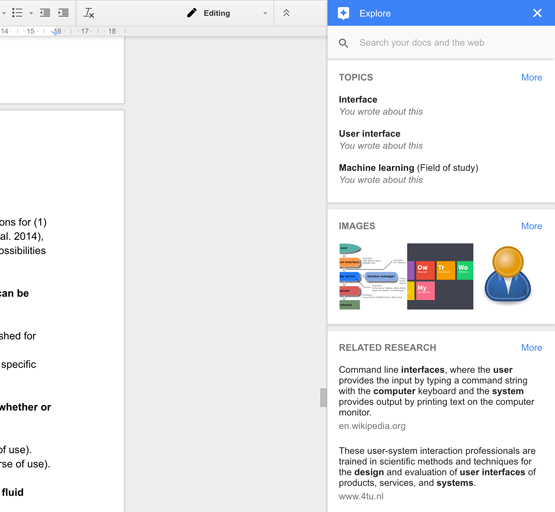
A good example comes from Microsoft. Their Application Word 2016 provides a research tool called Smart Lookup. This concept is similar to the Google Docs feature Explore. While Google Explore is a smart addition of Google Search with some recommendations to your document, Smart Lookup is a smart addition of Microsoft’s search engine Bing that provides you with additional information about a word or phrase by highlighting it in your document.
The first time the user opens Smart Lookup, he or she has to agree to a dialog that states “We value your privacy”. Word tells the user that the highlighted term and some surrounding content (whatever that means) will be send to Bing (Microsoft’s search engine), and recommends the user to read the privacy statement.
Once the user has clicked “Got it!”, the Insights panel displays a list of resources from Wikipedia and Bing about the selected word or phrase. There’s an additional tab that provides the user with a definition of the selection.
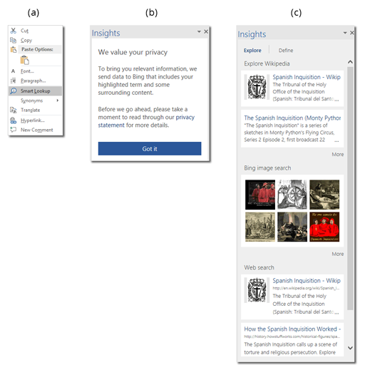
This example illustrates four strategies, (1) interrupting the user just once at the first time of use, (2) explaining to the user what the system is about to do, (3) providing the user with a link to more information, and (4) asking the user for permission. This example covers most of the factors named by Höök (2000). What’s missing here is the ability of the user to revoke access to the permission he gave by clicking “Got it”. Therefore the user can feel not in control and consider his privacy not sufficiently enough protected. The revoke of access to the data can provide the user with control and therefore let him feel his privacy sufficiently protected. The implementation of an access revoke in this example can provide more trust in the system. Because it must be considered that some users may push the button “Got it” by accident. These users must be provided an easy way to undo this action of data transmission approval. This can be done by an undo button at the bottom of the Insights panel right after the user clicked “Got it”. This button can use a short countdown until it disappears. But this option can’t just disappear, it has to be accessible at anytime in the future. And therefore the user has to understand where to find the option to revoke the access when the undo button is gone. This lets the user feel in control and can provide the user with the feeling that his or her privacy is protected sufficiently.
Split the user model
Adaptive UIs need to build models of the user, environment and platform. Because privacy concerns are a user issue, Cook and Kay (1994) proposed to split the user model into two parts, one public and one private. This split can help to overcome these trust and privacy issues a user may have. The private and public model is about the information a user shares. A user can share information in two different ways: information a user shares with the system (platform) and information a user shares with others (environment).
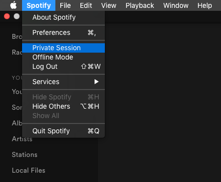
Spotify is one example for sharing information in both ways. A user of Spotify shares information with the platform and the environment by default. To control the information you share with the environment Spotify offers the “Private Session” option. When you enable a “Private Session”, nothing is posted to Facebook, Spotify Social and Last.fm. This option is also considered to not take the songs too much into account of Spotify’s interpretation of your music taste, while a private session is on, which is not officially confirmed by Spotify.
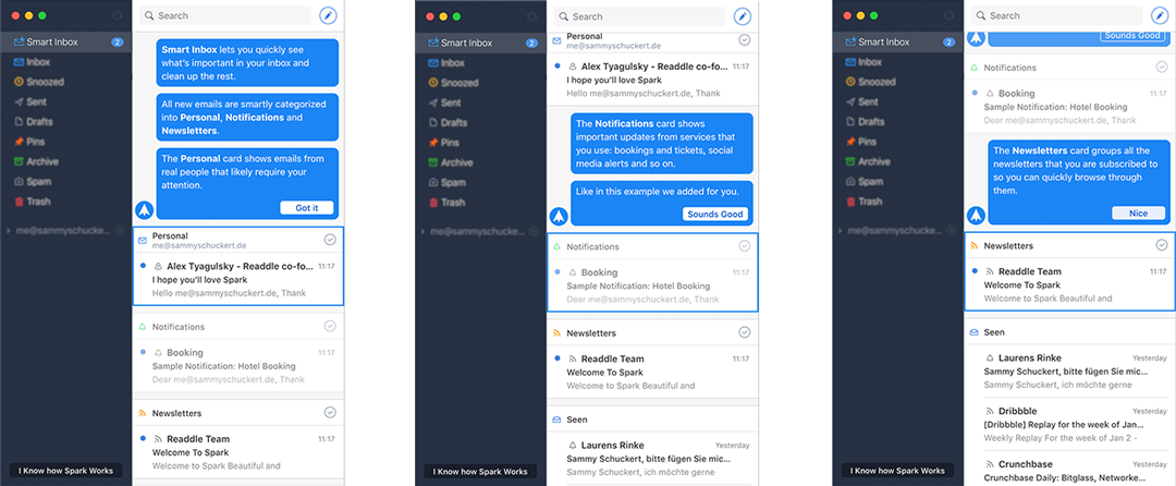
According to Jameson (2009), allowing the user to control visibility of adaptations is supposed to have a positive effect on the privacy concerns of a user. An example of an application that allows the user to control the visibility of adaptation is the smart email application Spark. This application uses adaptation to automatically sort the user‘s emails into three categories, notifications, newsletters, and private. To control the visibility of the adaptation, Spark offers the user a fast and easy way to switch between both user models, adaptive and non-adaptive. This is done by a toggle at the top bar of the application. To turn off the adaptive user model, simply use the toggle. It is not reported if this toggle changes the access to information that a user shares with the platform.

Keep expectations right
Nothing is more painful than to expect a system to do something it is not capable of. Therefore we have to consider a system as a system. Höök (2000) points out that some adaptive systems tend to feel like humans. Anthropomorphic appearance is bad for the expectations of the capabilities, the user expects too much from the system (Jameson 2008). So make clear what a system is capable of and what it is not. Don‘t emotionalize the system by making it too anthropomorphic – always remember Clippy!
Don’t underestimate habits
Why haven’t more users switched from Google to Bing? Habits keep us loyal. A user familiar with Google’s interface has a hard time switching to Bing, even though the interface is mostly similar. The slightest change makes all the difference. Bing feels totally different for day to day Google users’, even though the technology and most of the experience is the same. Bing disrupts the flow of a Google user - the flow he has evolved to navigate successfully, like a natural landscape by car. The safety, consistency, visibility, and predictability forms his flow, his habit. Remember: Habits are deep bound to humanity, don’t underestimate them. Try to rely on them and try not to interrupt them.
Make it reasonable
The principle Make it reasonable is all about findability and understandability.
As described in Chapter 3 Control, Transparency and Predictability, Adaptive UIs tend to be less predictive than direct manipulation software, because of their ability to change the UI and content dynamically based on the context of use. Today’s direct manipulation UIs have already outstripped the limits of predictability. Therefore it is better to provide a valid reason for an action of an Adaptive UI than to make the action predictable. A reasonable action to the user makes it more likely to surprise and therefore provide a delightful user experience. This principle provide several strategies to support reasonable actions in Adaptive UIs.
Provide Consistency
Adaptive UIs tend to violate consistency in software behaviour in the process of UI adaptation. Researchers pointed to this as major challenge for acceptance of Adaptive UIs (Gajos et al. 2006). Yang et al. (2016) suggest this might be less of a problem today than in the past. They argue that consumer online tools and mobile apps continuously update their interface which expose users to a frequent pace of UI change never seen with traditional desktop applications and operating systems. This is mainly due to the rise of lean and agile software development and design processes. Therefore Yang et al. (2016) suspect today’s users to be more robust to UI changes and will more easily accept and appreciate Adaptive UIs. Neither or less, there are some strategies to consider for providing consistency in the process of UI adaptation.
If adaptation relocates UI elements, the locality is especially important (Findlater & Gajos 2009). Such spatial adapted elements should be located near the original position to facilitate the discoverability (Hartmann 2009). Billsus et al. (2002) recommended to always support multiple modes of information access, e.g. providing both sets of items, recommended and an alpha-ordered, helping the user to build a spatial model.
If adaptation use cross application functionality, the UI should be similar to the UI of the stand alone application integrated into the adapted UI. This supports the user to apply known patterns and reduce cognitive workload.
Provide context
Providing context can help the user to inspect the user’s model of the application. Explicit context provides information about which data were collected and makes it more easier for the user to decide to go with a recommendation of the system. This may include information about the data base of recommendations, filters or list sorting. One Example which does provide context to recommendations really well is Spotify (see Figure 62). The user gets detailed insights about which data was used to find the recommendations. Therefore the user can more easily decide on the action to take and make reason of the recommendation, e.g. music from Blush sounds similar to music from Foo Fighters, therefore the action may not be predictable but reasonable. And as mentioned, a reasonable recommendation which wasn’t predicted has a chance to surprise and delight. Context can also be provided to recommendations that reduce workload, e.g. Google Explore (see Figure 63). This is another example of an application providing reasons to recommendations. Explore provides the user with context to shortcut search terms, based on the text written in the document. Therefore the user is able to understand the action an approve it as reasonable or not.

Explain systems actions
The underlying complexity of AI algorithms in adaptive UI design means that the designer needs to pay special attention to transparency and explanation (Lieberman 2009). Lieberman (2009) further explains that Adaptive UIs may require more tutorials or progressive introduction of features in order to acquaint the user with its capabilities.
A great example of an application that makes use of a tutorial introduction to an adaptive feature set, is Spark. Spark is a Email Application that automatically sorts your Emails into three categories (see Chapter 4 Split the user model). To ensure the user understands this intelligent behaviour, they introduce this rules while users first-time experience (see Figure 64, 65 & 66).
For the tutorial, Spark uses its product’s content to instruct its customer about what the application do Hurff (2016). They automatically send three messages, one of each category to the users inbox.
The subject line and email source implicate and support each category, while the text within the message discusses more about how to manipulate the adaptation. The tutorial is a step by step conversation between the user and the application, if already familiar with the adaptive behaviour the user can skip the tutorial at any time.
Make it transparent
As mentioned in Chapter 3.4.2 transparency of the system’s inner workings is one the crucial factors that ensures usability of adaptive systems. It is to note that the user don’t always need a complete model of how the system works, as long as it works and most user can’t be bothered with a complete model of the system.
Therefore it is to decide how much transparency to a system is needed based on the complexity of the system itself and the task performed. According to Jameson (2008), the more complex a task performed on the user’s behalf is the more transparency is required. It is to mention that transparency can be applied in two ways to an adaptive system, (1) transparency before an action, e.g. inspection or correction of the user model, and (2) transparency after an action, e.g., action history or correction of actions. This chapter proposes three strategies to apply for more transparency of an adaptive system.
Whenever needed, adaptive systems should allow the user to easily correct the adaptation. This helps the user to feel in control which influence transparency (Höök 2000). Especially when adaptive systems are far on the right side of the IP-Continuum presented in Chapter 3.3.2 (high level of adaptivity) their adaptation need to be easily correctable. Because those systems tend to perform tasks on the user’s behalf. To maintain transparency and controllability it is recommended to implement the break strategy presented in chapter 4.3.2 or to explicit ask for correction or revoke when the task is complex and it’s likely to get the adaptation wrong.
Ease of correction
Whenever needed, adaptive systems should allow the user to easily correct the adaptation. This helps the user to feel in control which influence transparency (Höök 2000). Especially when adaptive systems are far on the right side of the IP-Continuum presented in Chapter 3.3.2 (high level of adaptivity) their adaptation need to be easily correctable. Because those systems tend to perform tasks on the user’s behalf. To maintain transparency and controllability it is recommended to implement the break strategy presented in chapter 4.3.2 or to explicit ask for correction or revoke when the task is complex and it’s likely to get the adaptation wrong.

Allow inspection of user model
Allowing the user to inspect the user model is highly recommended as this helps the system a lot to remain usable as presented in chapter 4.3. This provides transparency to the adaptive interface before the adaptation. Therefore it lets the user feel in control which supports transparency and trust in the system (Höök 2000).
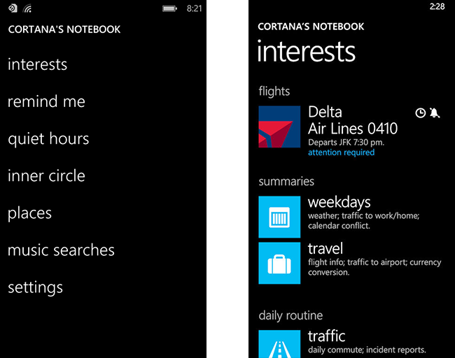
Microsoft’s personal assistant Cortana is one example which does use this strategy very well. Besides Cortana, other personal assistant systems, e.g, Amazon Alexa, Apple Siri, allow the user to inspect their user model. However non of these system does it in the same detail as Cortana. Cortana offers the user to inspect and correct all variables of the user model, which functions as data basis for almost every adaptation (see Figure 68).
Allow inspection of history
The inspection of the history of action can be another strategy that provide transparency to an adaptive UI. This strategy brings the possibility to include other strategies, like validation (see chapter 4.3.2). One example of the history strategy together with the validation strategy can be found in the mobile application Amazon Alexa. Amazon Alexa provides a detailed history of its understanding, voice recordings and asks explicit for validation.